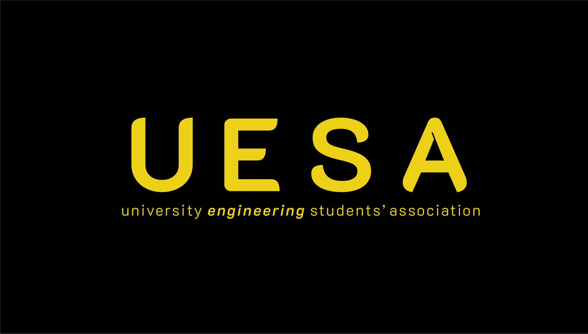
After a thorough review of the logo, we decided to create a new icon, simply using the letter 'E'. I took inspiration from graphs and waves, as well as trying to keep the logo as minimal-looking as possible. I then designed a variety of different 'E' symbols, to see which would work best for their organisation.