The aim of this project was to create a cluster-package that includes a soda-drink, crisps and nuts.
With this bottle and labelling, I wanted the typography to be bold and to be the main focus. Colour-wise, the blue and orange tones were matched purposely.
For the crisps packaging, I wanted it to be very illustrative.
This includes an illustration of a client subscribed to the service and encourages clients to participate in order to get an illustration of them on the next month's package.
As for the nuts packaging, it was placed in a can form since it would be more adaptable for parties.
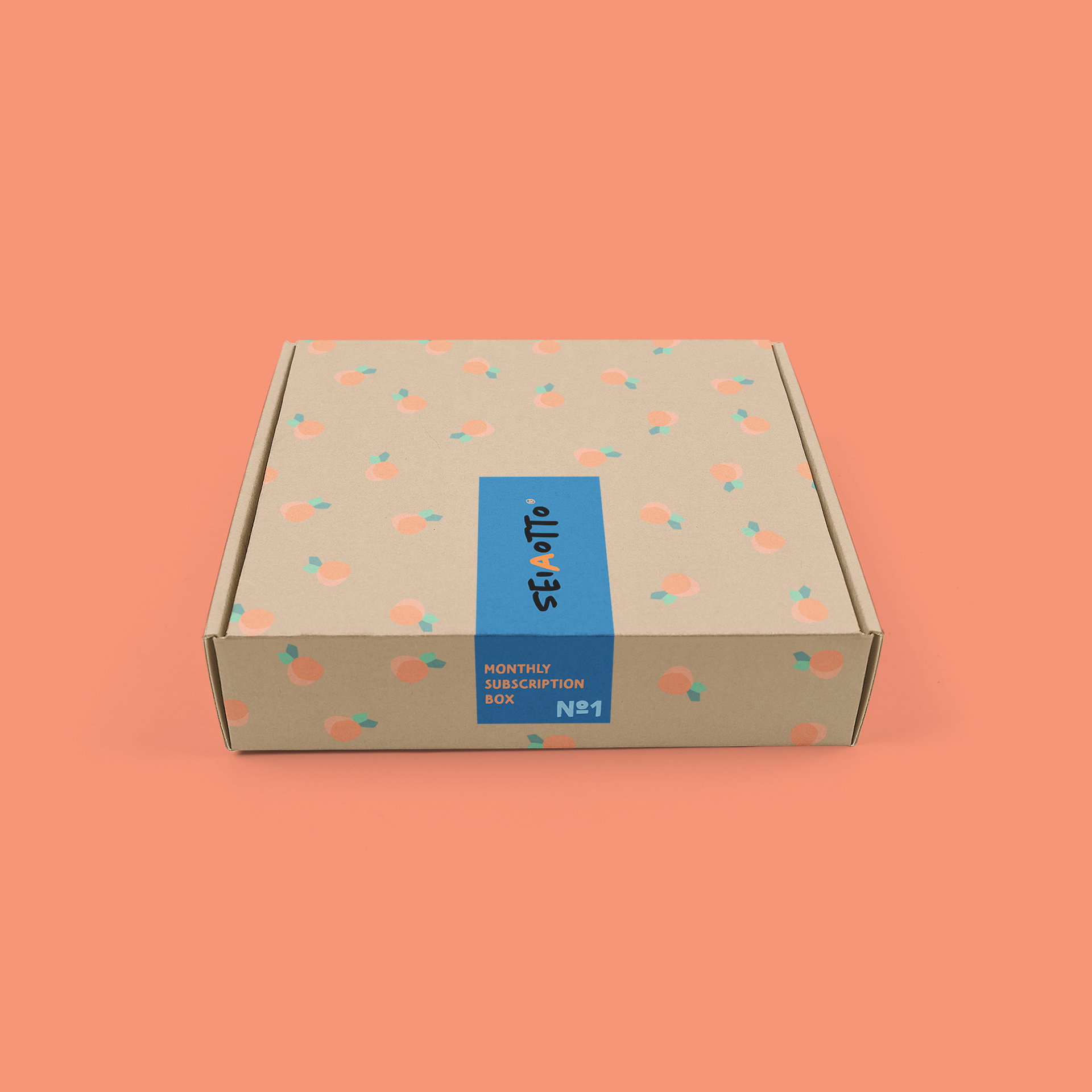
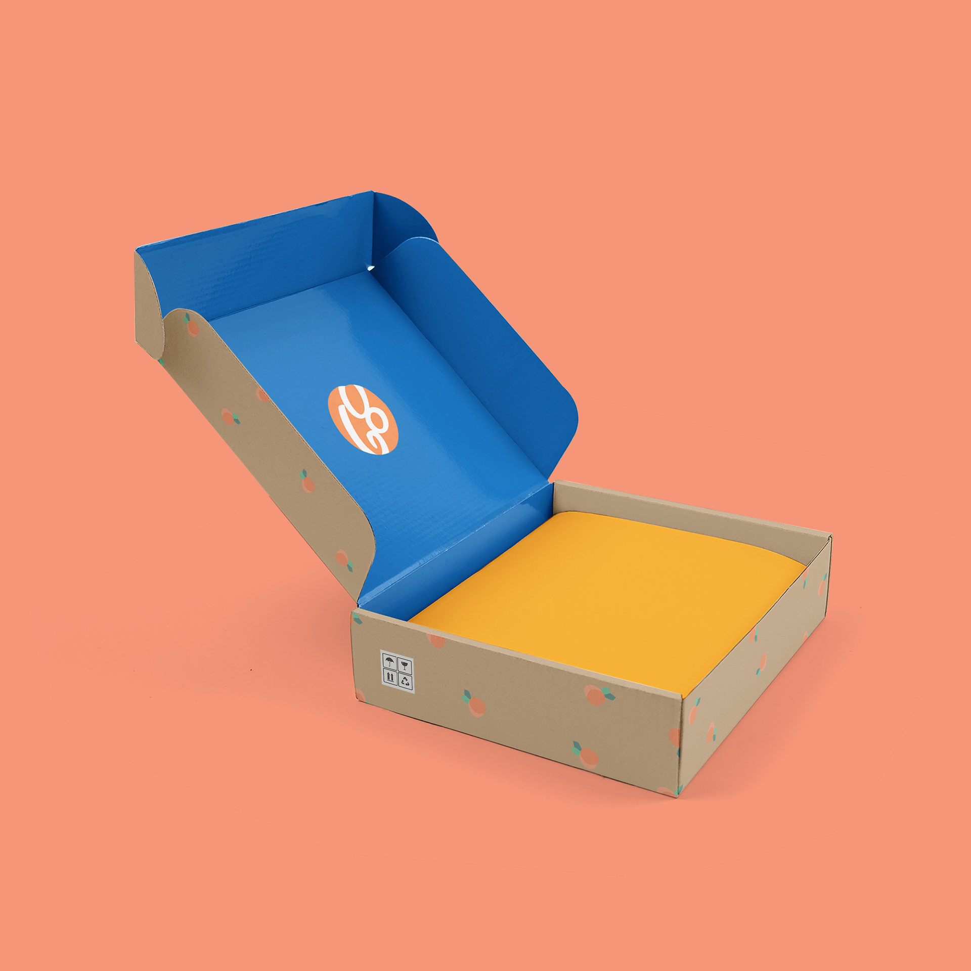
Last but not least, the box package itself portrays what the client would be expecting that month. In this case, the peaches represent the peach soda drink.


